


Premium Healthcare SaaS Platform
web app
Turning a Basic MVP into a Premium Healthcare SaaS Experience
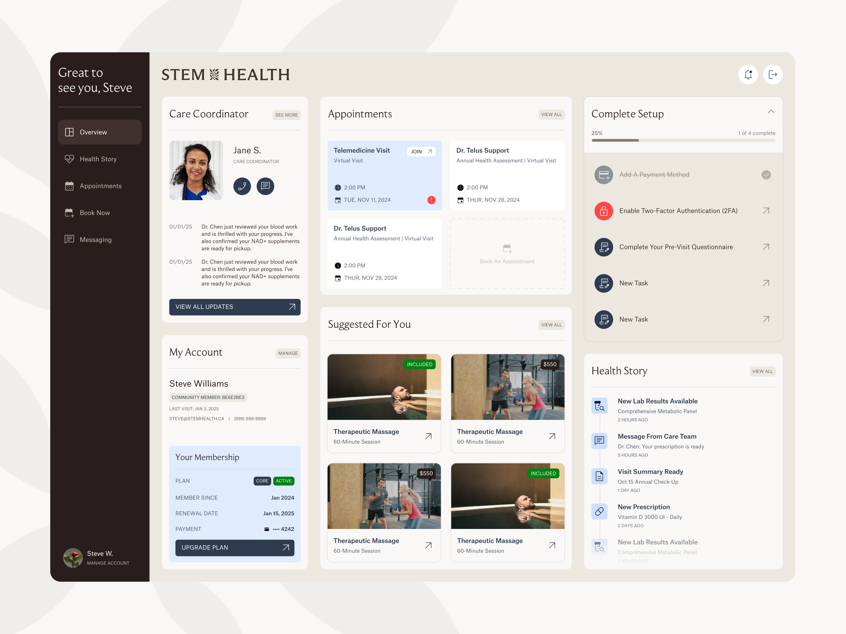
StemHealth is a premium healthcare hub designed for executives, high-income families, and corporate members who want a more proactive way to manage their health. The platform brings together appointment booking, care team communication, health history, lab results, medical questionnaires, and personalized services in one member-facing experience.
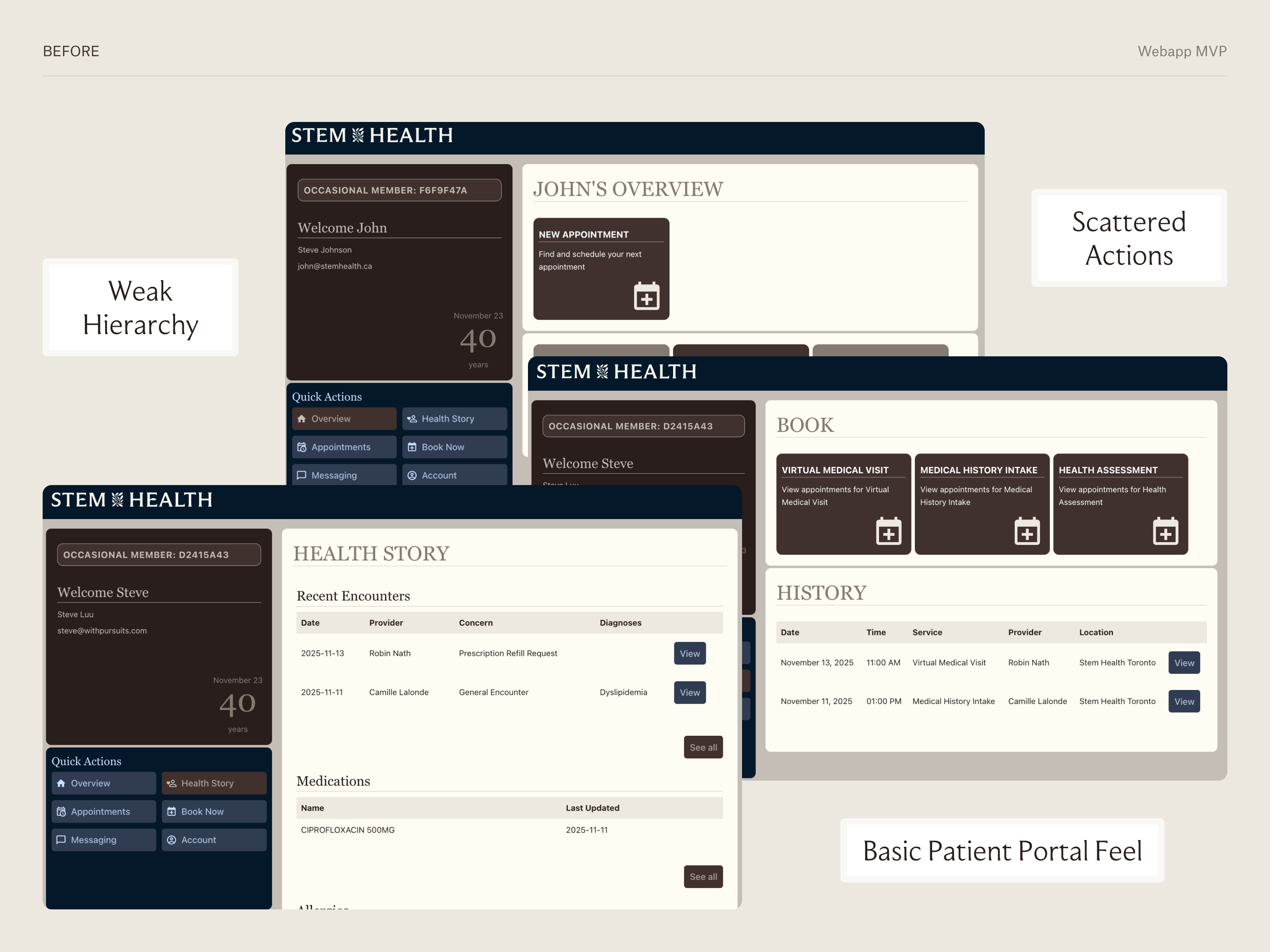
When I joined the project, StemHealth already had an MVP. The core functionality was there, but the experience felt fragmented, visually basic, and not aligned with the premium, concierge-style positioning of the brand. My role was to redesign the main product experience, clarify the hierarchy, and create a more polished foundation for the dashboard, appointments, booking, and health history flows.
The Challenge
The biggest challenge was ambiguity.
StemHealth had many valuable features, but the MVP did not clearly communicate what members should focus on first. Navigation, setup tasks, booking actions, health records, and account information were competing for attention.
The interface also felt closer to a basic patient portal than a premium healthcare product. For a platform serving high-value members, the experience needed to feel calmer, more trustworthy, and easier to act on.
The core question became:
How might we turn a complex healthcare MVP into a clear, premium, and action-oriented member experience?
Goals
The redesign focused on four main goals:
- Create clarity by organizing the most important member actions and health information.
- Make the product feel premium, calm, and trustworthy.
- Improve core flows for appointment management, booking, and health history.
- Build a scalable interface foundation that could support future services, recommendations, lab results, and care team interactions.
Strategy
Since I did not have access to direct user research or post-launch analytics, I used the available inputs as design insights: the existing MVP, stakeholder feedback, the product brief, brand direction, and healthcare SaaS best practices.
I started by identifying what the member needed to know, do, or trust at each point in the experience.
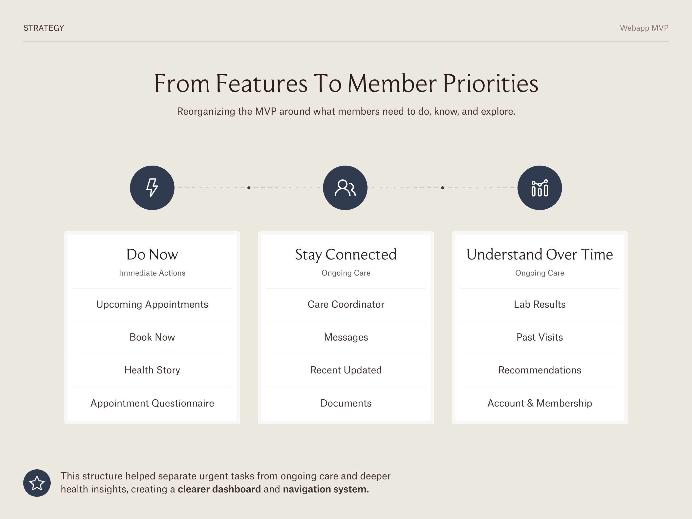
From there, I organized the product around three levels of priority:
- Immediate actions: upcoming appointments, setup tasks, booking, and urgent care prompts.
- Ongoing care: recent health updates, care team messages, documents, and recommendations.
- Deeper exploration: full health history, lab results, service details, and past appointments.
This helped transform the product from a collection of features into a more guided healthcare experience.
Execution
I focused the redesign on three key areas of the product:
- The Overview dashboard, where members land and understand what matters now.
- The Appointments experience, where members review upcoming and past visits and start a guided booking flow.
- The Health Story page, where members explore their medical history, lab results, recommendations, and follow-up actions.
Each screen was redesigned to improve hierarchy, reduce cognitive load, and make the product feel more mature and aligned with StemHealth’s premium positioning.
Key UX Decision 1: Redesigning the Overview as a Member Command Center
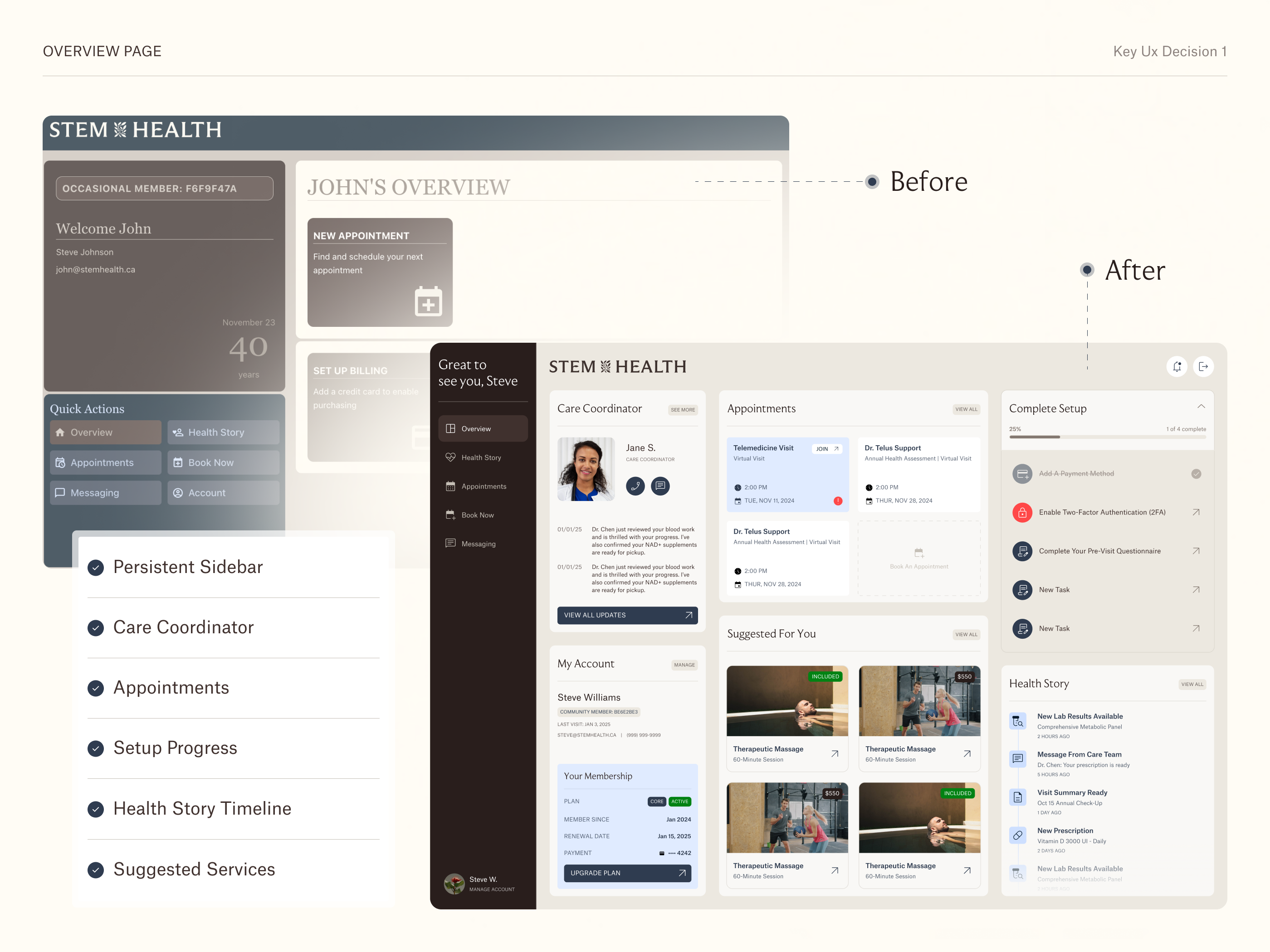
The original Overview page had useful functionality, but the hierarchy was weak. Account information, quick actions, setup tasks, booking prompts, and past visits were shown with similar visual weight, making the screen feel cluttered and unfinished.
I redesigned the Overview into a structured member dashboard.
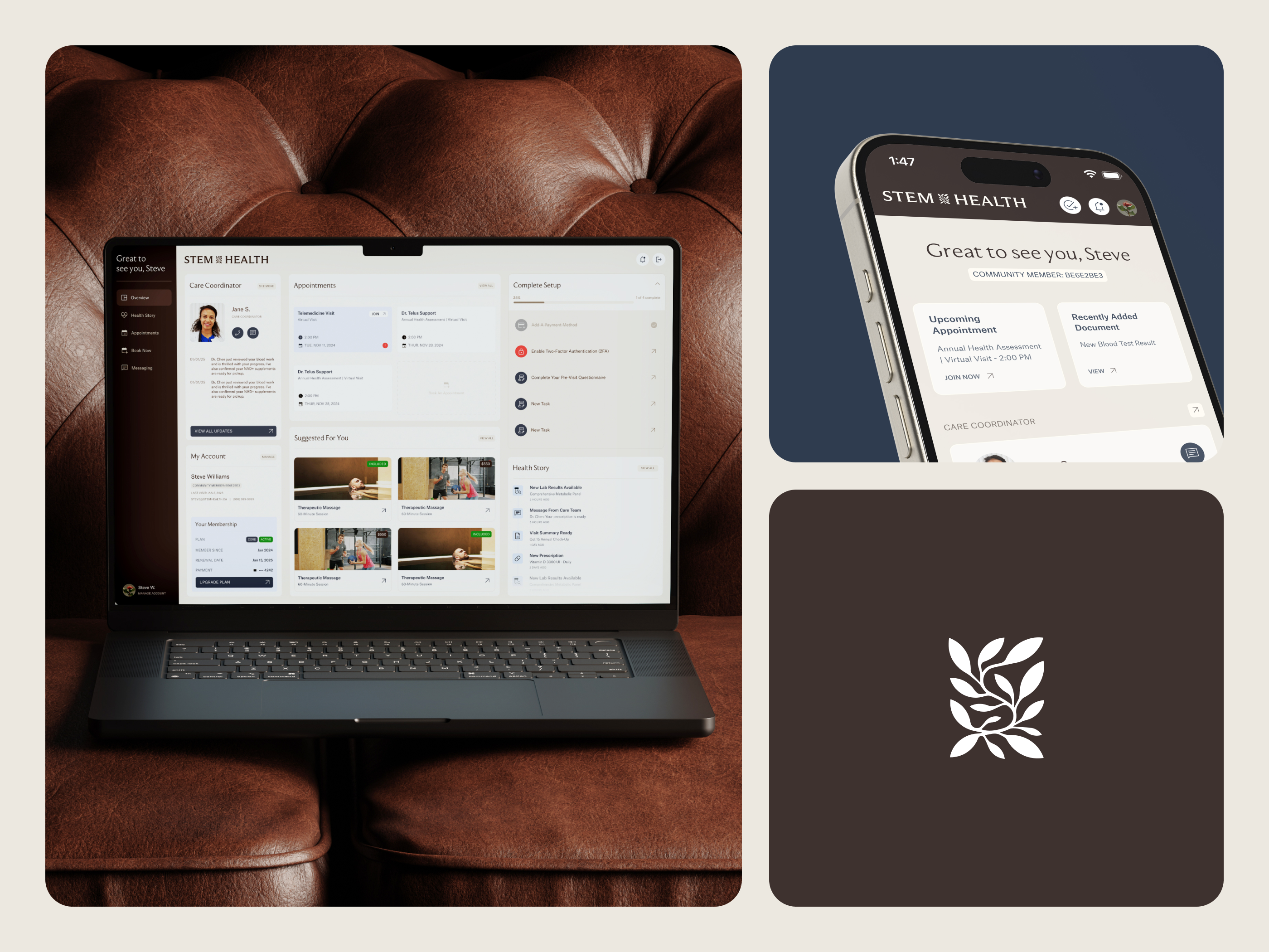
The new version separates navigation from tasks, introduces a dedicated care coordinator area, makes appointments more actionable, surfaces setup progress, and brings Health Story updates into the homepage.
This helped the dashboard answer the most important member questions:
- What is coming up next?
- What needs my attention?
- What changed recently?
- How do I contact my care team?
- Where should I go next?
The result was a clearer and more human experience that felt less like an admin panel and more like a premium healthcare hub.
Key UX Decision 2: Separating Appointment Management from Appointment Booking
The MVP Appointments page combined booking cards with a basic history table. It worked functionally, but it felt static and administrative.
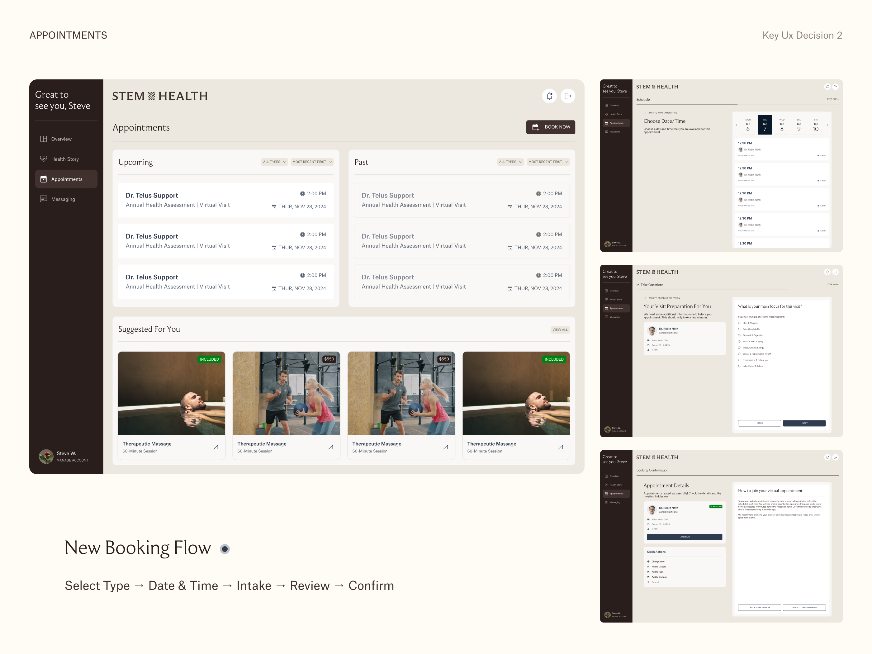
I redesigned the page into a clearer appointment management experience.
Instead of forcing users to choose an appointment type immediately through large static cards, I created a page where members could first understand their upcoming and past visits, then enter booking through a single primary CTA.
The redesigned page separates Upcoming and Past appointments, introduces filters and sorting, and includes a secondary area for suggested services.
This made the experience easier to scan and more scalable as members accumulate more visits over time.
For booking, I treated the flow as a guided process instead of a single form. The structure became:
- Select appointment type
- Choose date and time
- Complete intake questions
- Review appointment details
- Confirm booking
This gave each step a clear purpose and made healthcare scheduling feel more intentional and less overwhelming.
Key UX Decision 3: Turning Health Story into a Timeline-Based Experience
The original Health Story page functioned like a static medical record. Encounters, medications, allergies, and medical history were displayed in basic tables with limited hierarchy or guidance.
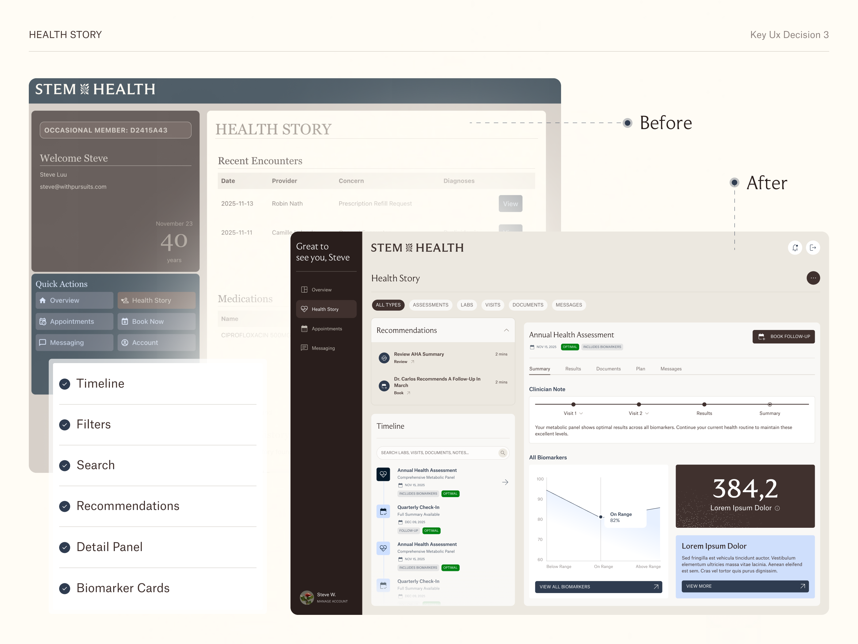
I redesigned Health Story as an interactive care timeline.
Because health history is naturally chronological, I used a timeline structure to help members understand what happened over time. The left side supports browsing, search, and filters. The right side provides deeper detail for the selected health event.
The redesigned structure includes:
- Content filters for assessments, labs, visits, documents, and messages.
- A searchable timeline of health events.
- A detail panel with summary, results, documents, plan, and messages.
- Contextual CTAs such as Book Follow-Up, Review, and View All Biomarkers.
- Visual components for lab results and biomarker insights.
This turned Health Story from passive record storage into a more proactive experience where members can understand their health journey and act on next steps.
UI Design
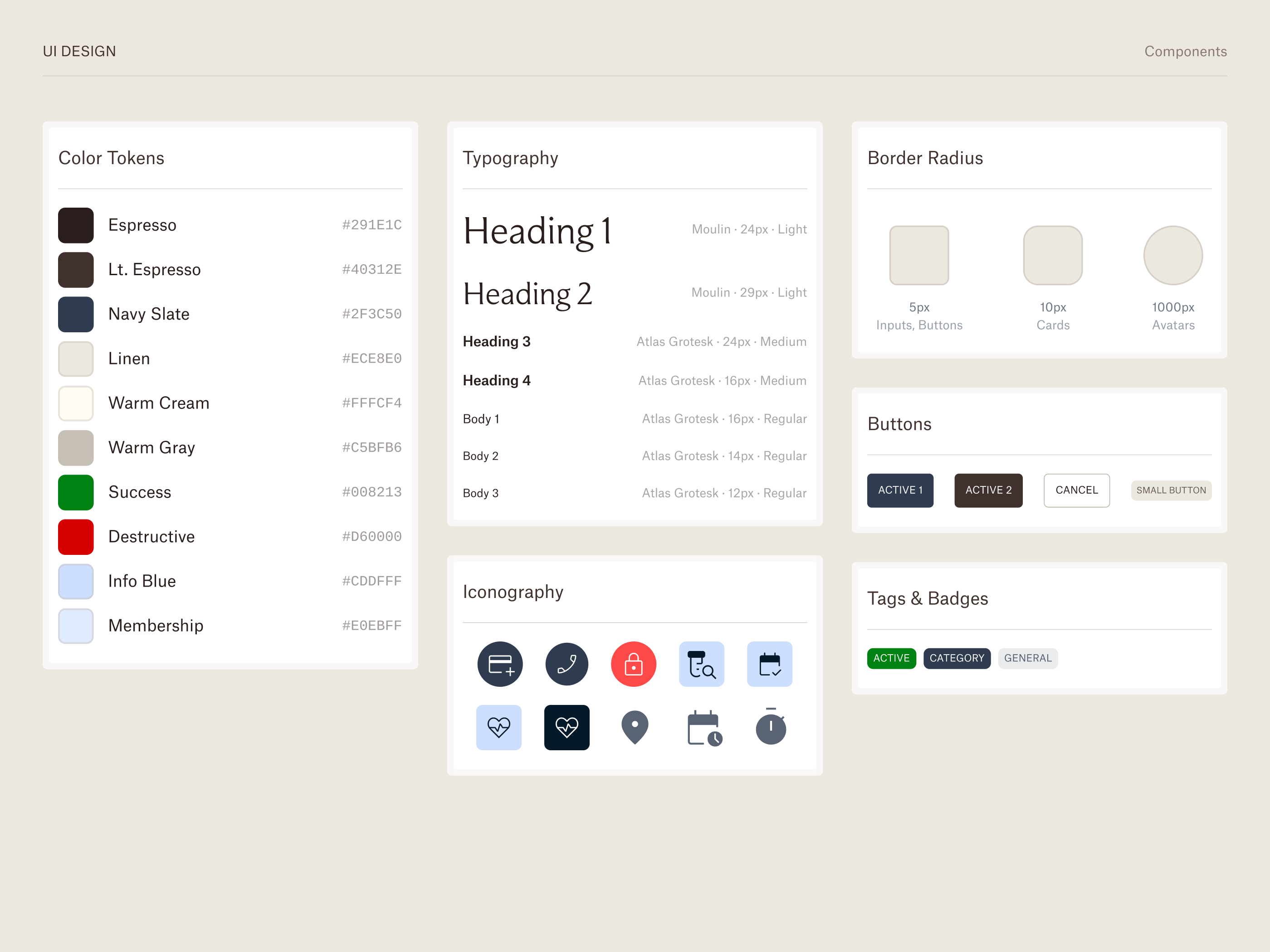
The visual direction needed to feel premium without becoming cold or overly corporate.
I used a calm neutral background, warm dark navigation, refined cards, soft contrast, clear typography, and subtle status indicators to create a more trustworthy healthcare experience.
The UI system included reusable patterns for:
- Navigation
- Cards
- Appointment items
- Setup tasks
- Timeline events
- Filter chips
- Status labels
- Progress indicators
- Healthcare recommendations
- Service cards
The goal was not only to make the product look better, but to make it feel more organized, reliable, and appropriate for a concierge healthcare audience.
Results
StemHealth was still in development, so I did not have access to post-launch analytics. Instead, the impact was measured through product clarity, stakeholder alignment, and the transformation of the MVP experience.
The redesign improved the product in several key ways:
- It clarified the structure of the dashboard.
- It separated navigation from member tasks.
- It made appointments easier to scan and manage.
- It turned booking into a guided flow.
- It transformed Health Story into a scalable timeline experience.
- It made the interface feel more premium and trustworthy.
- It created a stronger foundation for future product flows, including lab results, service booking, account settings, and task-based questionnaires.
Overall, the redesign helped StemHealth move from a functional but basic MVP toward a more polished healthcare SaaS experience aligned with its concierge positioning.
Reflection
This project taught me that ambiguous product challenges often require structure before visual design.
At first, StemHealth looked like a UI redesign. But the deeper challenge was product clarity. The platform had many useful features, but users needed a clearer way to understand what mattered now, what could be explored later, and how to move through their healthcare journey with confidence.
My biggest contribution was turning a fragmented MVP into a more intentional product experience. By improving hierarchy, simplifying key flows, and designing around member priorities, I helped create a product direction that felt clearer, calmer, and more aligned with the business vision.


let's create something together!

© all rights reserved.
riviele poliana


Premium Healthcare SaaS Platform
web app
Turning a Basic MVP into a Premium Healthcare SaaS Experience
StemHealth is a premium healthcare hub designed for executives, high-income families, and corporate members who want a more proactive way to manage their health. The platform brings together appointment booking, care team communication, health history, lab results, medical questionnaires, and personalized services in one member-facing experience.
When I joined the project, StemHealth already had an MVP. The core functionality was there, but the experience felt fragmented, visually basic, and not aligned with the premium, concierge-style positioning of the brand. My role was to redesign the main product experience, clarify the hierarchy, and create a more polished foundation for the dashboard, appointments, booking, and health history flows.
The Challenge
The biggest challenge was ambiguity.
StemHealth had many valuable features, but the MVP did not clearly communicate what members should focus on first. Navigation, setup tasks, booking actions, health records, and account information were competing for attention.
The interface also felt closer to a basic patient portal than a premium healthcare product. For a platform serving high-value members, the experience needed to feel calmer, more trustworthy, and easier to act on.
The core question became:
How might we turn a complex healthcare MVP into a clear, premium, and action-oriented member experience?
Goals
The redesign focused on four main goals:
- Create clarity by organizing the most important member actions and health information.
- Make the product feel premium, calm, and trustworthy.
- Improve core flows for appointment management, booking, and health history.
- Build a scalable interface foundation that could support future services, recommendations, lab results, and care team interactions.
Strategy
Since I did not have access to direct user research or post-launch analytics, I used the available inputs as design insights: the existing MVP, stakeholder feedback, the product brief, brand direction, and healthcare SaaS best practices.
I started by identifying what the member needed to know, do, or trust at each point in the experience.
From there, I organized the product around three levels of priority:
- Immediate actions: upcoming appointments, setup tasks, booking, and urgent care prompts.
- Ongoing care: recent health updates, care team messages, documents, and recommendations.
- Deeper exploration: full health history, lab results, service details, and past appointments.
This helped transform the product from a collection of features into a more guided healthcare experience.
Execution
I focused the redesign on three key areas of the product:
- The Overview dashboard, where members land and understand what matters now.
- The Appointments experience, where members review upcoming and past visits and start a guided booking flow.
- The Health Story page, where members explore their medical history, lab results, recommendations, and follow-up actions.
Each screen was redesigned to improve hierarchy, reduce cognitive load, and make the product feel more mature and aligned with StemHealth’s premium positioning.
Key UX Decision 1: Redesigning the Overview as a Member Command Center
The original Overview page had useful functionality, but the hierarchy was weak. Account information, quick actions, setup tasks, booking prompts, and past visits were shown with similar visual weight, making the screen feel cluttered and unfinished.
I redesigned the Overview into a structured member dashboard.
The new version separates navigation from tasks, introduces a dedicated care coordinator area, makes appointments more actionable, surfaces setup progress, and brings Health Story updates into the homepage.
This helped the dashboard answer the most important member questions:
- What is coming up next?
- What needs my attention?
- What changed recently?
- How do I contact my care team?
- Where should I go next?
The result was a clearer and more human experience that felt less like an admin panel and more like a premium healthcare hub.
Key UX Decision 2: Separating Appointment Management from Appointment Booking
The MVP Appointments page combined booking cards with a basic history table. It worked functionally, but it felt static and administrative.
I redesigned the page into a clearer appointment management experience.
Instead of forcing users to choose an appointment type immediately through large static cards, I created a page where members could first understand their upcoming and past visits, then enter booking through a single primary CTA.
The redesigned page separates Upcoming and Past appointments, introduces filters and sorting, and includes a secondary area for suggested services.
This made the experience easier to scan and more scalable as members accumulate more visits over time.
For booking, I treated the flow as a guided process instead of a single form. The structure became:
- Select appointment type
- Choose date and time
- Complete intake questions
- Review appointment details
- Confirm booking
This gave each step a clear purpose and made healthcare scheduling feel more intentional and less overwhelming.
Key UX Decision 3: Turning Health Story into a Timeline-Based Experience
The original Health Story page functioned like a static medical record. Encounters, medications, allergies, and medical history were displayed in basic tables with limited hierarchy or guidance.
I redesigned Health Story as an interactive care timeline.
Because health history is naturally chronological, I used a timeline structure to help members understand what happened over time. The left side supports browsing, search, and filters. The right side provides deeper detail for the selected health event.
The redesigned structure includes:
- Content filters for assessments, labs, visits, documents, and messages.
- A searchable timeline of health events.
- A detail panel with summary, results, documents, plan, and messages.
- Contextual CTAs such as Book Follow-Up, Review, and View All Biomarkers.
- Visual components for lab results and biomarker insights.
This turned Health Story from passive record storage into a more proactive experience where members can understand their health journey and act on next steps.
UI Design
The visual direction needed to feel premium without becoming cold or overly corporate.
I used a calm neutral background, warm dark navigation, refined cards, soft contrast, clear typography, and subtle status indicators to create a more trustworthy healthcare experience.
The UI system included reusable patterns for:
- Navigation
- Cards
- Appointment items
- Setup tasks
- Timeline events
- Filter chips
- Status labels
- Progress indicators
- Healthcare recommendations
- Service cards
The goal was not only to make the product look better, but to make it feel more organized, reliable, and appropriate for a concierge healthcare audience.
Results
StemHealth was still in development, so I did not have access to post-launch analytics. Instead, the impact was measured through product clarity, stakeholder alignment, and the transformation of the MVP experience.
The redesign improved the product in several key ways:
- It clarified the structure of the dashboard.
- It separated navigation from member tasks.
- It made appointments easier to scan and manage.
- It turned booking into a guided flow.
- It transformed Health Story into a scalable timeline experience.
- It made the interface feel more premium and trustworthy.
- It created a stronger foundation for future product flows, including lab results, service booking, account settings, and task-based questionnaires.
Overall, the redesign helped StemHealth move from a functional but basic MVP toward a more polished healthcare SaaS experience aligned with its concierge positioning.
Reflection
This project taught me that ambiguous product challenges often require structure before visual design.
At first, StemHealth looked like a UI redesign. But the deeper challenge was product clarity. The platform had many useful features, but users needed a clearer way to understand what mattered now, what could be explored later, and how to move through their healthcare journey with confidence.
My biggest contribution was turning a fragmented MVP into a more intentional product experience. By improving hierarchy, simplifying key flows, and designing around member priorities, I helped create a product direction that felt clearer, calmer, and more aligned with the business vision.
let's create something together!
© all rights reserved.
riviele poliana


Premium Healthcare SaaS Platform
web app
Turning a Basic MVP into a Premium Healthcare SaaS Experience
StemHealth is a premium healthcare hub designed for executives, high-income families, and corporate members who want a more proactive way to manage their health. The platform brings together appointment booking, care team communication, health history, lab results, medical questionnaires, and personalized services in one member-facing experience.
When I joined the project, StemHealth already had an MVP. The core functionality was there, but the experience felt fragmented, visually basic, and not aligned with the premium, concierge-style positioning of the brand. My role was to redesign the main product experience, clarify the hierarchy, and create a more polished foundation for the dashboard, appointments, booking, and health history flows.
The Challenge
The biggest challenge was ambiguity.
StemHealth had many valuable features, but the MVP did not clearly communicate what members should focus on first. Navigation, setup tasks, booking actions, health records, and account information were competing for attention.
The interface also felt closer to a basic patient portal than a premium healthcare product. For a platform serving high-value members, the experience needed to feel calmer, more trustworthy, and easier to act on.
The core question became:
How might we turn a complex healthcare MVP into a clear, premium, and action-oriented member experience?
Goals
The redesign focused on four main goals:
- Create clarity by organizing the most important member actions and health information.
- Make the product feel premium, calm, and trustworthy.
- Improve core flows for appointment management, booking, and health history.
- Build a scalable interface foundation that could support future services, recommendations, lab results, and care team interactions.
Strategy
Since I did not have access to direct user research or post-launch analytics, I used the available inputs as design insights: the existing MVP, stakeholder feedback, the product brief, brand direction, and healthcare SaaS best practices.
I started by identifying what the member needed to know, do, or trust at each point in the experience.
From there, I organized the product around three levels of priority:
- Immediate actions: upcoming appointments, setup tasks, booking, and urgent care prompts.
- Ongoing care: recent health updates, care team messages, documents, and recommendations.
- Deeper exploration: full health history, lab results, service details, and past appointments.
This helped transform the product from a collection of features into a more guided healthcare experience.
Execution
I focused the redesign on three key areas of the product:
- The Overview dashboard, where members land and understand what matters now.
- The Appointments experience, where members review upcoming and past visits and start a guided booking flow.
- The Health Story page, where members explore their medical history, lab results, recommendations, and follow-up actions.
Each screen was redesigned to improve hierarchy, reduce cognitive load, and make the product feel more mature and aligned with StemHealth’s premium positioning.
Key UX Decision 1: Redesigning the Overview as a Member Command Center
The original Overview page had useful functionality, but the hierarchy was weak. Account information, quick actions, setup tasks, booking prompts, and past visits were shown with similar visual weight, making the screen feel cluttered and unfinished.
I redesigned the Overview into a structured member dashboard.
The new version separates navigation from tasks, introduces a dedicated care coordinator area, makes appointments more actionable, surfaces setup progress, and brings Health Story updates into the homepage.
This helped the dashboard answer the most important member questions:
- What is coming up next?
- What needs my attention?
- What changed recently?
- How do I contact my care team?
- Where should I go next?
The result was a clearer and more human experience that felt less like an admin panel and more like a premium healthcare hub.
Key UX Decision 2: Separating Appointment Management from Appointment Booking
The MVP Appointments page combined booking cards with a basic history table. It worked functionally, but it felt static and administrative.
I redesigned the page into a clearer appointment management experience.
Instead of forcing users to choose an appointment type immediately through large static cards, I created a page where members could first understand their upcoming and past visits, then enter booking through a single primary CTA.
The redesigned page separates Upcoming and Past appointments, introduces filters and sorting, and includes a secondary area for suggested services.
This made the experience easier to scan and more scalable as members accumulate more visits over time.
For booking, I treated the flow as a guided process instead of a single form. The structure became:
- Select appointment type
- Choose date and time
- Complete intake questions
- Review appointment details
- Confirm booking
This gave each step a clear purpose and made healthcare scheduling feel more intentional and less overwhelming.
Key UX Decision 3: Turning Health Story into a Timeline-Based Experience
The original Health Story page functioned like a static medical record. Encounters, medications, allergies, and medical history were displayed in basic tables with limited hierarchy or guidance.
I redesigned Health Story as an interactive care timeline.
Because health history is naturally chronological, I used a timeline structure to help members understand what happened over time. The left side supports browsing, search, and filters. The right side provides deeper detail for the selected health event.
The redesigned structure includes:
- Content filters for assessments, labs, visits, documents, and messages.
- A searchable timeline of health events.
- A detail panel with summary, results, documents, plan, and messages.
- Contextual CTAs such as Book Follow-Up, Review, and View All Biomarkers.
- Visual components for lab results and biomarker insights.
This turned Health Story from passive record storage into a more proactive experience where members can understand their health journey and act on next steps.
UI Design
The visual direction needed to feel premium without becoming cold or overly corporate.
I used a calm neutral background, warm dark navigation, refined cards, soft contrast, clear typography, and subtle status indicators to create a more trustworthy healthcare experience.
The UI system included reusable patterns for:
- Navigation
- Cards
- Appointment items
- Setup tasks
- Timeline events
- Filter chips
- Status labels
- Progress indicators
- Healthcare recommendations
- Service cards
The goal was not only to make the product look better, but to make it feel more organized, reliable, and appropriate for a concierge healthcare audience.
Results
StemHealth was still in development, so I did not have access to post-launch analytics. Instead, the impact was measured through product clarity, stakeholder alignment, and the transformation of the MVP experience.
The redesign improved the product in several key ways:
- It clarified the structure of the dashboard.
- It separated navigation from member tasks.
- It made appointments easier to scan and manage.
- It turned booking into a guided flow.
- It transformed Health Story into a scalable timeline experience.
- It made the interface feel more premium and trustworthy.
- It created a stronger foundation for future product flows, including lab results, service booking, account settings, and task-based questionnaires.
Overall, the redesign helped StemHealth move from a functional but basic MVP toward a more polished healthcare SaaS experience aligned with its concierge positioning.
Reflection
This project taught me that ambiguous product challenges often require structure before visual design.
At first, StemHealth looked like a UI redesign. But the deeper challenge was product clarity. The platform had many useful features, but users needed a clearer way to understand what mattered now, what could be explored later, and how to move through their healthcare journey with confidence.
My biggest contribution was turning a fragmented MVP into a more intentional product experience. By improving hierarchy, simplifying key flows, and designing around member priorities, I helped create a product direction that felt clearer, calmer, and more aligned with the business vision.