


PREMIUM LEGAL EVENT PLATFORM
webSITE
Short intro
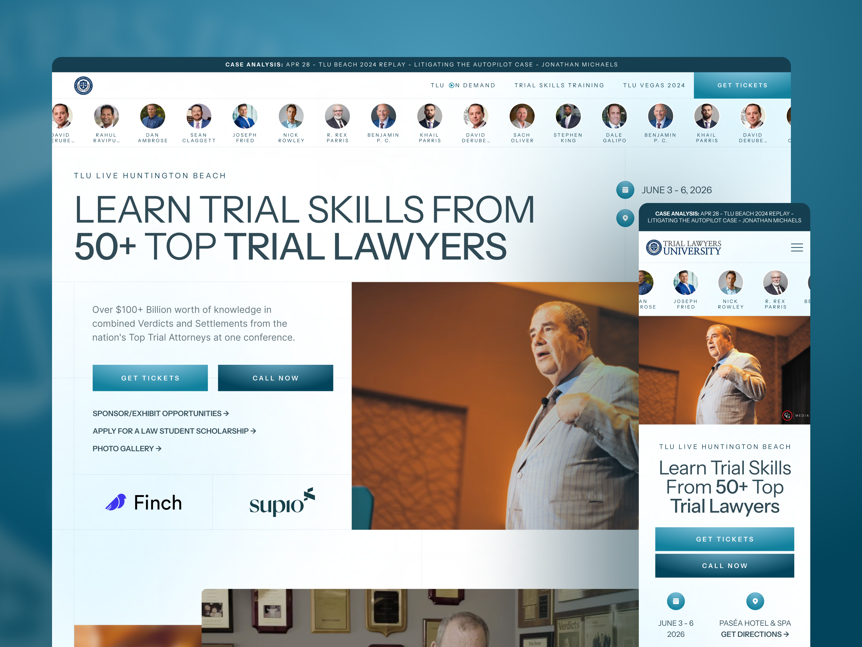
Redesigned TLU Beach, a premium legal event platform, to improve clarity, agenda readability, and cross-page consistency. Led UX/UI across 7 pages, used AI-assisted prototypes to test desktop and mobile directions, and reduced cognitive load by reinforcing key event information across Lecture and Registration flows.
Snapshot
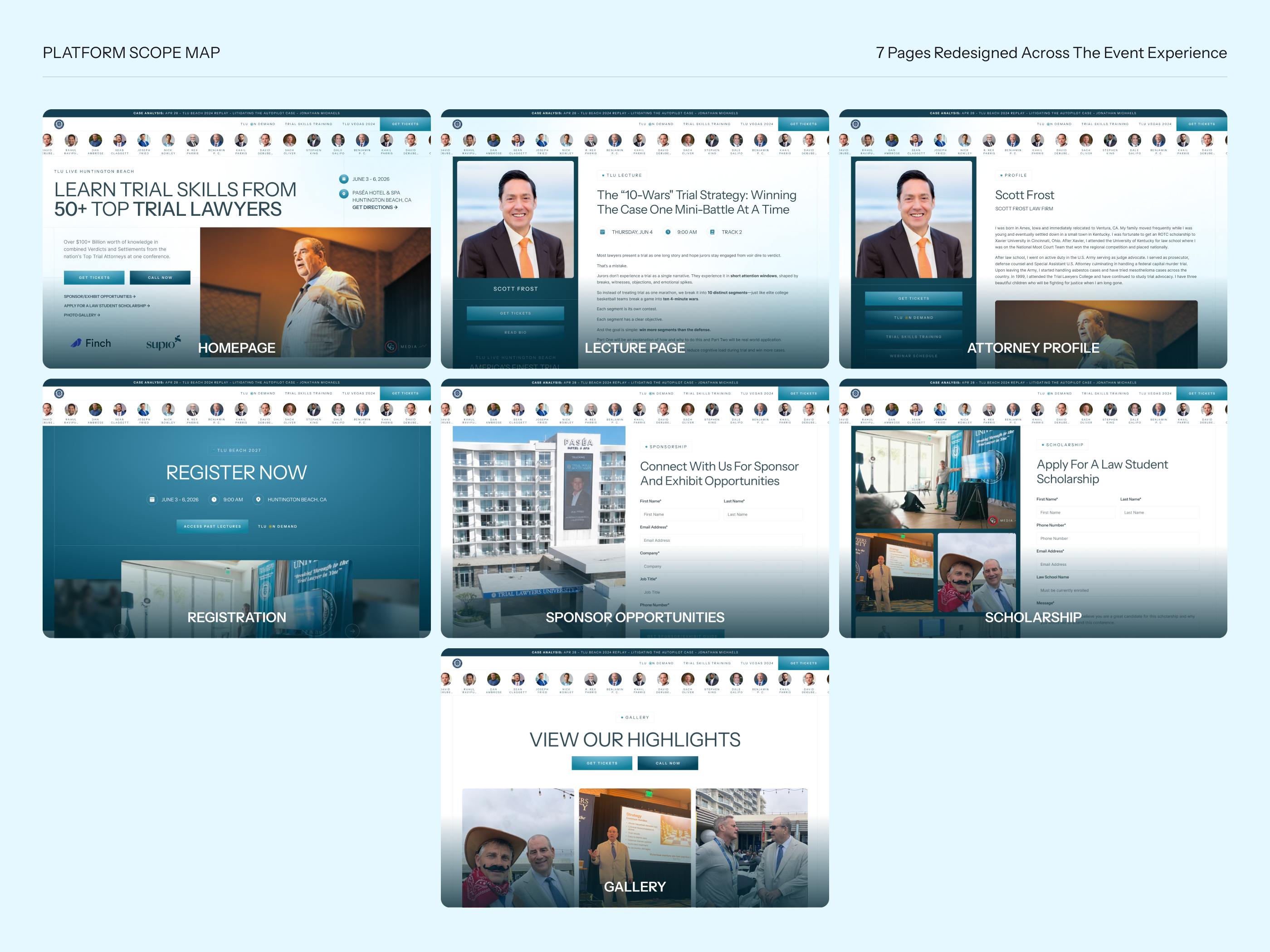
Role: Lead Product / Web DesignerProject type: Full website redesignPlatform scope: Marketing + event information + registration experiencePages designed: Homepage; Lecture Page; Attorney Profile; Registration; Sponsor and Exhibit Opportunities; Law Student Scholarship; Gallery
My role
I led the redesign of the platform from a UX/UI perspective, improving the structure, readability, and overall event experience across desktop and mobile. I also used AI-assisted prototyping to test layout directions faster and make stronger decisions during exploration.
The Problem
Summary
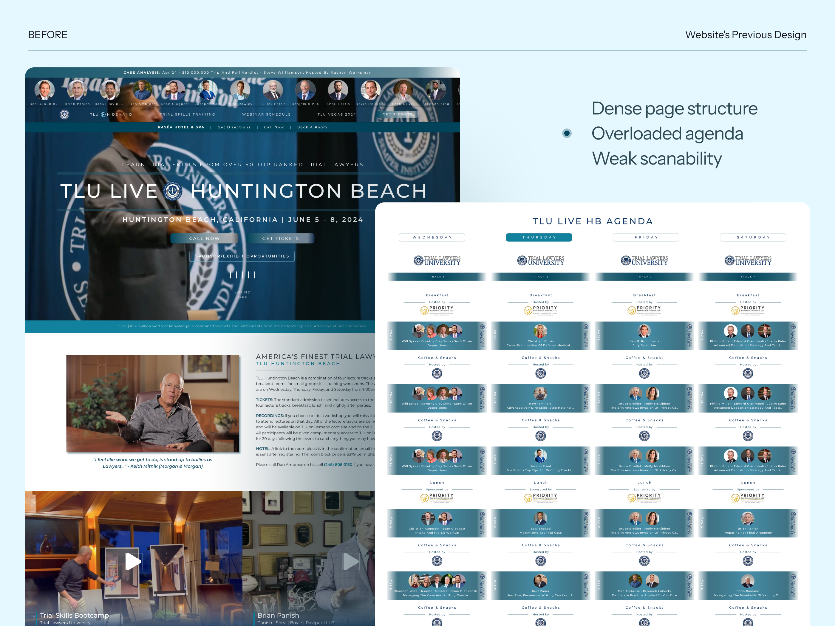
The original website had strong content and credibility, but the experience felt dense, visually overloaded, and harder to scan than it should be. Important information existed, but users had to work too hard to understand the value of the event, browse the agenda, and move through the experience with confidence.
Key issues
- The homepage contained a lot of valuable information, but weak hierarchy made everything compete for attention
- The agenda was one of the most content-heavy areas and needed better readability and prioritization
- Important event details were not consistently reinforced across pages
- Secondary pages needed a clearer structure and a stronger relationship to the overall event journey
- The platform needed to feel more premium and scalable without losing information
Opportunity
The redesign was an opportunity to transform the site from a dense event page into a more polished and structured platform that helped users:
- Understand the event faster
- Scan content more easily
- Navigate lectures and speakers more confidently
- Register with less friction
- Perceive the event as high-value and professionally curated
My responsibilities
I worked on the redesign from end to end, focusing on both UX clarity and visual quality. My work included:
- Restructuring the information hierarchy
- Improving the homepage flow
- Redesigning the agenda experience
- Exploring layout directions for desktop and mobile
- Designing supporting internal pages
- Reinforcing important event information across the experience
- Refining decisions based on internal team feedback
Main design goals
- Make the platform easier to scan
- Improve agenda readability
- Reduce cognitive load across key pages
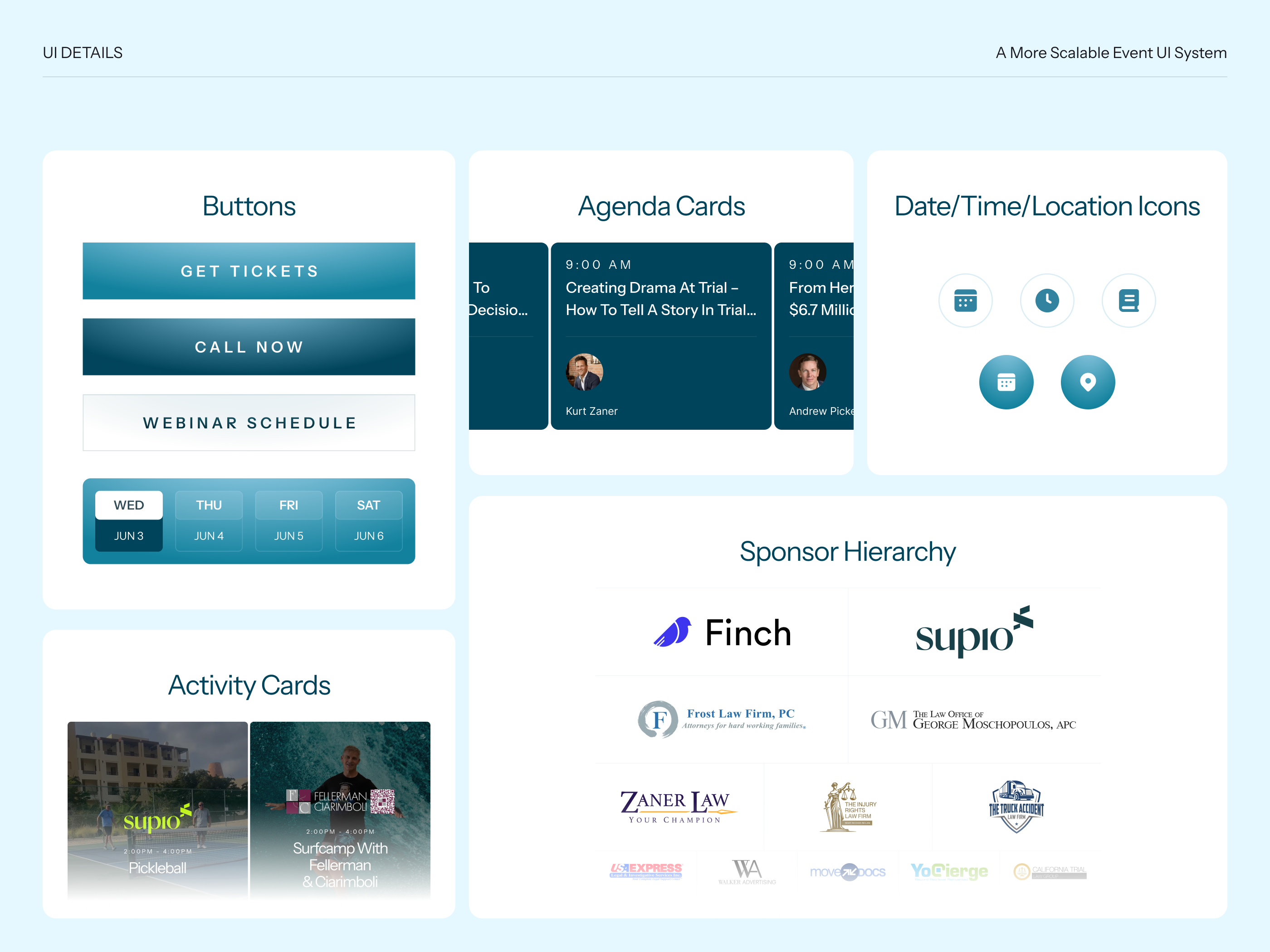
- Create a more premium and cohesive visual system
- Support multiple event-related flows beyond the homepage
- Build a design system that could scale to many speakers, lectures, and sponsors
Process, AI Prototypes, and Iteration
How I approached it
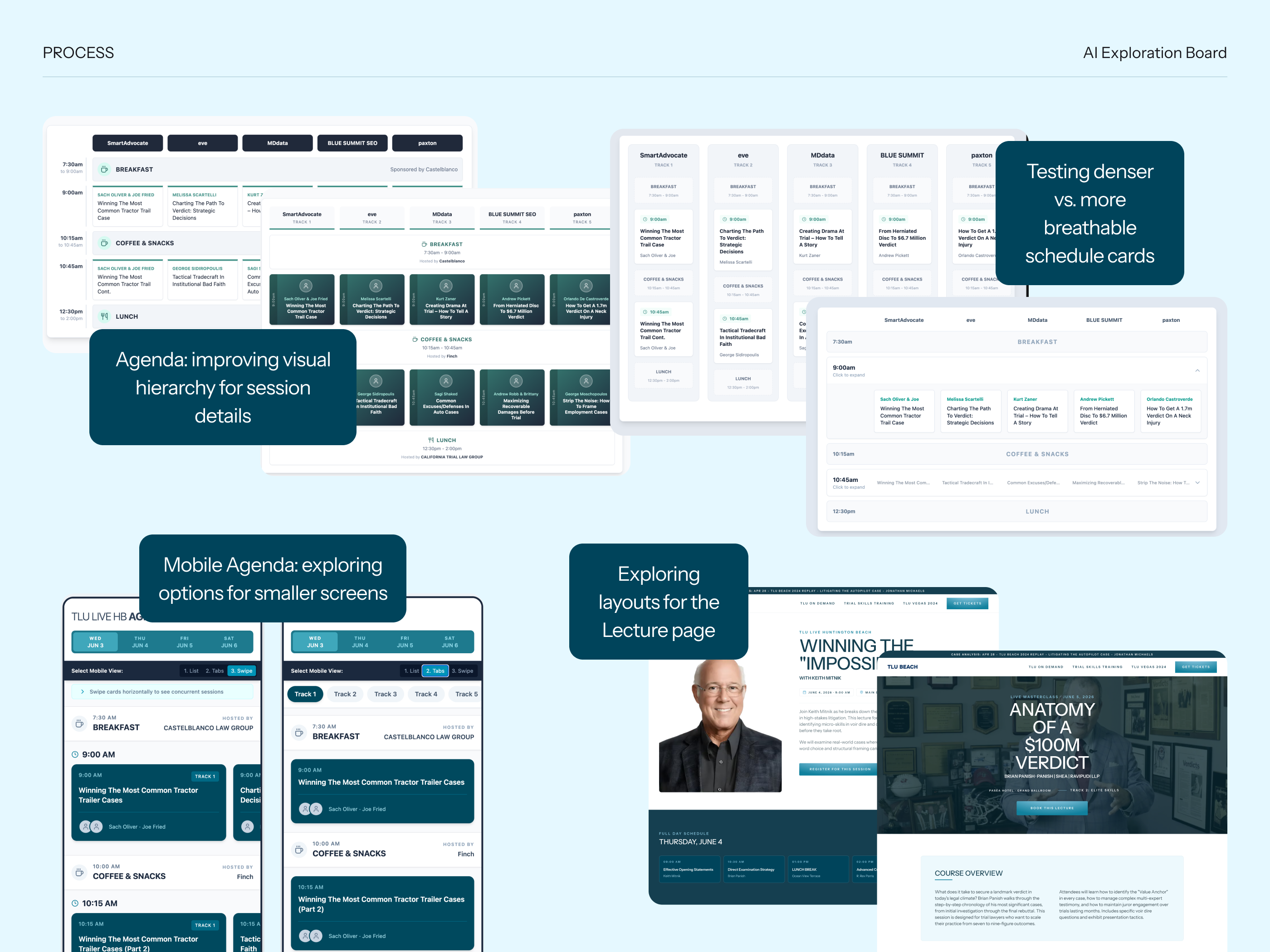
One of the most important parts of this project was using AI-assisted prototypes to accelerate exploration and decision-making, especially in the most complex content areas.
I used AI as a design exploration tool to quickly test different layout directions for both desktop and mobile, then refined those ideas through design judgment and internal team feedback.
Where AI helped most
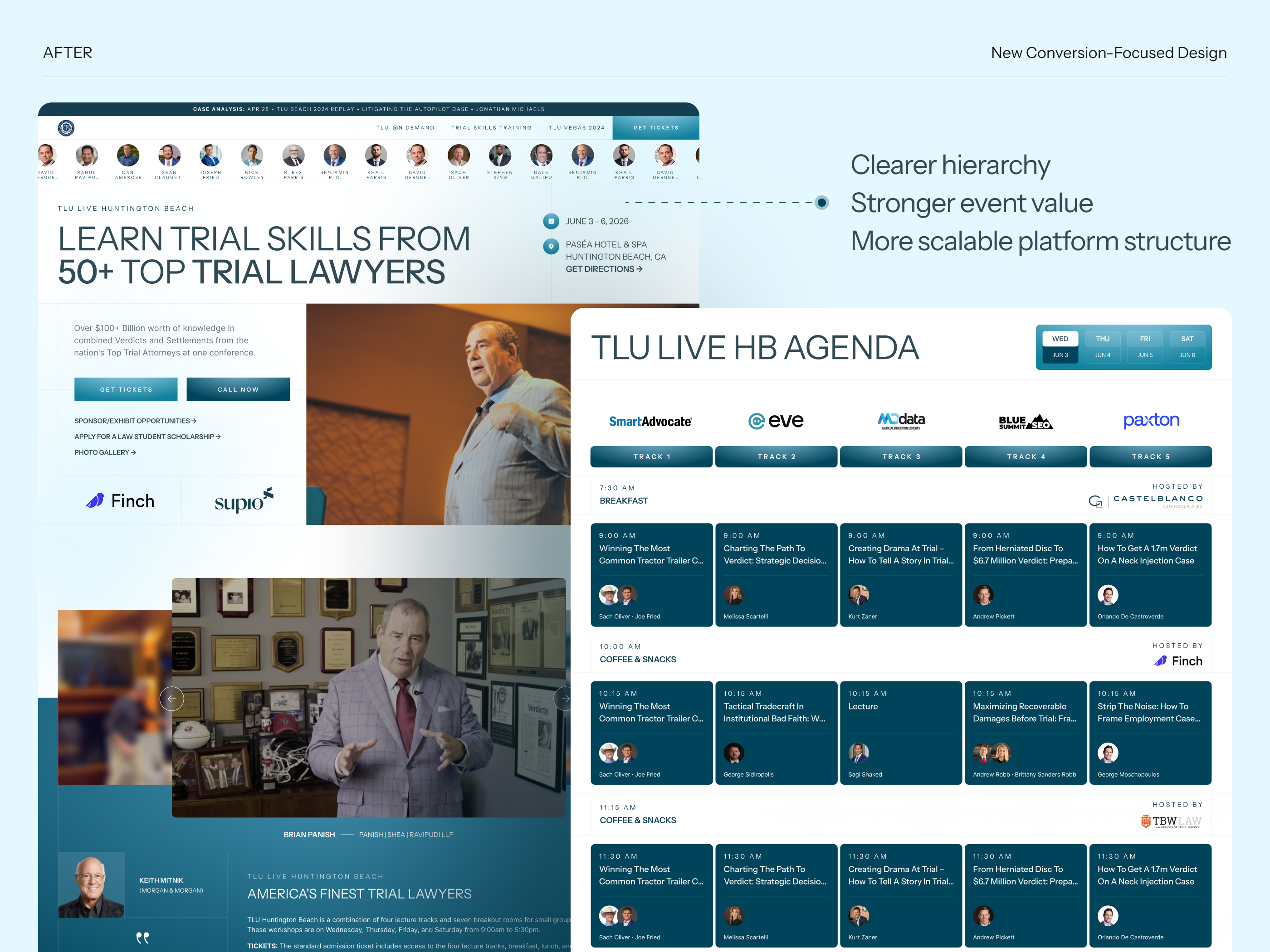
Homepage agendaThis was the biggest area of experimentation. I tested multiple concepts to figure out how to better surface dense schedule information, improve scanability, and highlight what mattered most. Based on internal feedback, I optimized the final direction to make the agenda easier to read and navigate.
Lecture PageI explored alternative content structures and layouts to make the page more useful, clearer, and more aligned with the event ecosystem.
Attorney Bio PageI used AI exploration here to experiment with content presentation and structure, helping me compare options before refining the final layout manually.
Key design decision
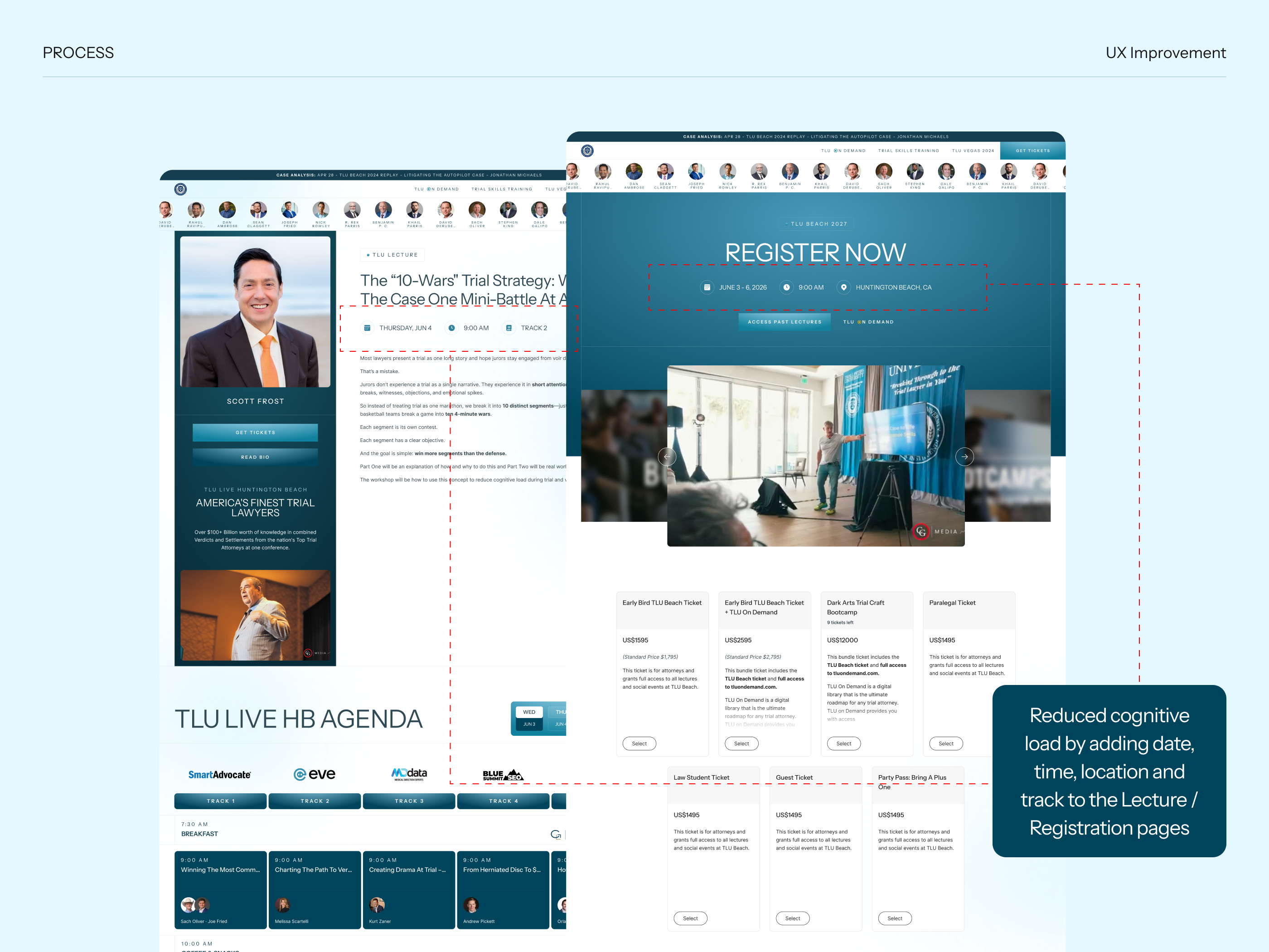
A major improvement was repeating the date, time, and location information on the Lecture and Registration pages. These details were not previously emphasized in the same way. Adding them again reduced cognitive load and helped users stay oriented without needing to go back and search for core event details.
What changed through iteration
- Stronger content grouping
- Better visual hierarchy
- Easier reading in agenda-heavy layouts
- More intentional repetition of key event details
- Improved clarity across desktop and mobile concepts
Final Solution
Overview
The final design transformed the platform into a clearer and more premium event experience, with better hierarchy, stronger readability, and improved consistency across pages.
What was designed
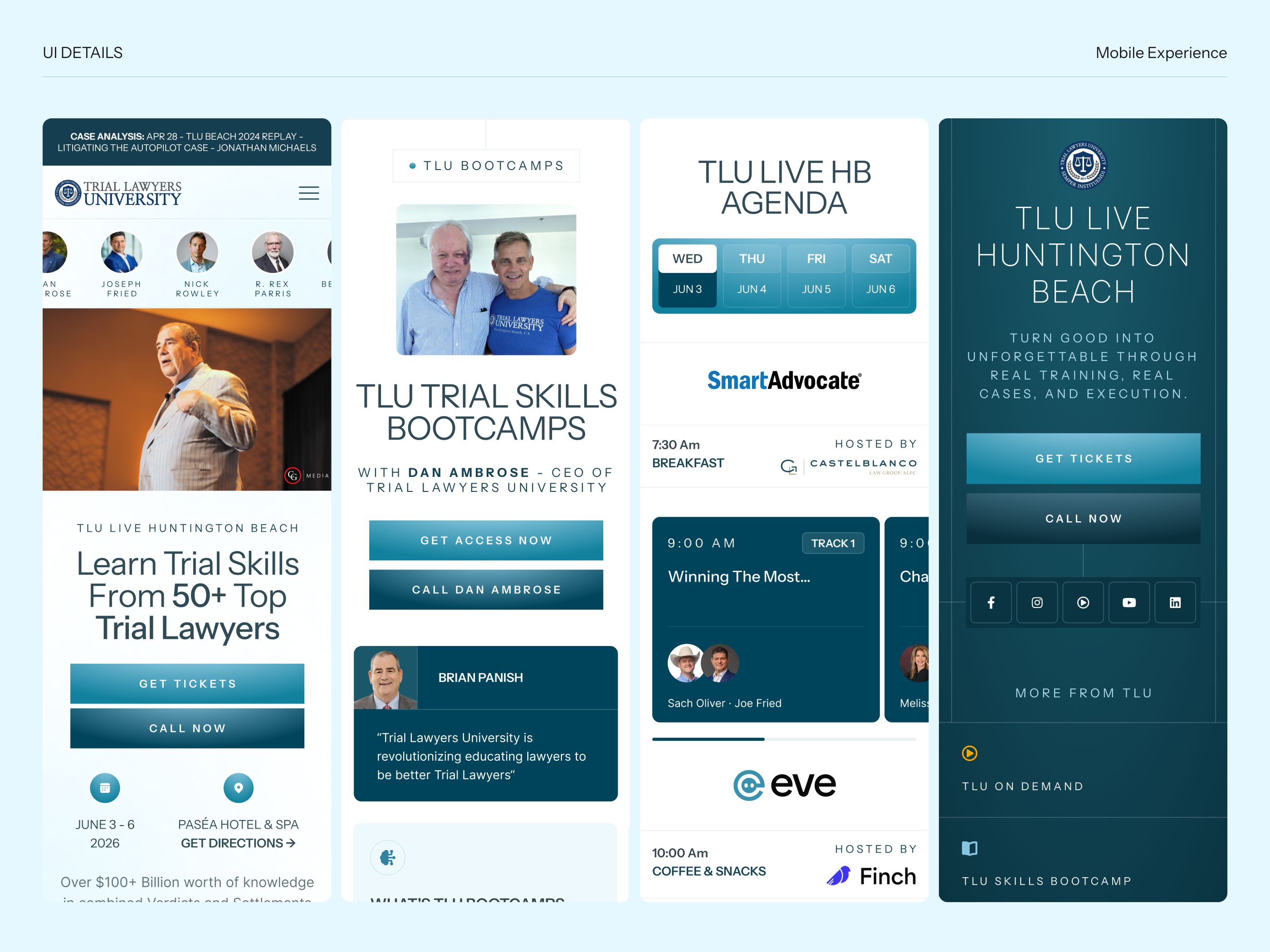
HomepageRedesigned to better communicate the event value, structure the content more clearly, and improve the browsing experience for agenda, bootcamps, activities, and sponsors.
Lecture PageReworked to better organize content and reduce cognitive load, including the addition of repeated date, time, and location information.
Attorney ProfileDesigned to support speaker credibility and make attorney information easier to browse and understand.
RegistrationClarified the event context and improved orientation by reintroducing key information like date, time, and location.
Sponsor and Exhibit OpportunitiesStructured to better communicate sponsorship value and support sponsor-related conversion.
Law Student ScholarshipCreated as a dedicated page to support a specific audience segment with a focused, easy-to-follow experience.
GalleryDesigned to extend the event story visually and reinforce the atmosphere and prestige of the event.
Biggest UX improvements
- Better homepage hierarchy
- More readable and structured agenda
- Reduced cognitive load in key user flows
- More cohesive experience across pages
- Improved support for both marketing and event navigation needs
Outcome
The redesign created a more structured and scalable event platform that better matched the quality of the TLU Beach experience. The final product made it easier for users to scan, understand, and navigate content across a wide set of event-related pages.
Key wins
- Turned a dense event website into a more guided experience
- Improved agenda readability through exploration and iteration
- Used AI prototypes to increase clarity and speed up decision-making
- Reduced cognitive load by repeating essential event details where they mattered most
- Created a more cohesive platform across multiple page types
- Strengthened the premium feel of the brand experience
Reflection
This project was a strong example of balancing content density, usability, and brand perception. It also showed how AI can be useful in a practical product design workflow, not as a replacement for design thinking, but as a way to explore more directions faster and make clearer decisions.


let's create something together!

© all rights reserved.
riviele poliana


PREMIUM LEGAL EVENT PLATFORM
webSITE
Short intro
Redesigned TLU Beach, a premium legal event platform, to improve clarity, agenda readability, and cross-page consistency. Led UX/UI across 7 pages, used AI-assisted prototypes to test desktop and mobile directions, and reduced cognitive load by reinforcing key event information across Lecture and Registration flows.
Snapshot
Role: Lead Product / Web DesignerProject type: Full website redesignPlatform scope: Marketing + event information + registration experiencePages designed: Homepage; Lecture Page; Attorney Profile; Registration; Sponsor and Exhibit Opportunities; Law Student Scholarship; Gallery
My role
I led the redesign of the platform from a UX/UI perspective, improving the structure, readability, and overall event experience across desktop and mobile. I also used AI-assisted prototyping to test layout directions faster and make stronger decisions during exploration.
The Problem
Summary
The original website had strong content and credibility, but the experience felt dense, visually overloaded, and harder to scan than it should be. Important information existed, but users had to work too hard to understand the value of the event, browse the agenda, and move through the experience with confidence.
Key issues
- The homepage contained a lot of valuable information, but weak hierarchy made everything compete for attention
- The agenda was one of the most content-heavy areas and needed better readability and prioritization
- Important event details were not consistently reinforced across pages
- Secondary pages needed a clearer structure and a stronger relationship to the overall event journey
- The platform needed to feel more premium and scalable without losing information
Opportunity
The redesign was an opportunity to transform the site from a dense event page into a more polished and structured platform that helped users:
- Understand the event faster
- Scan content more easily
- Navigate lectures and speakers more confidently
- Register with less friction
- Perceive the event as high-value and professionally curated
My responsibilities
I worked on the redesign from end to end, focusing on both UX clarity and visual quality. My work included:
- Restructuring the information hierarchy
- Improving the homepage flow
- Redesigning the agenda experience
- Exploring layout directions for desktop and mobile
- Designing supporting internal pages
- Reinforcing important event information across the experience
- Refining decisions based on internal team feedback
Main design goals
- Make the platform easier to scan
- Improve agenda readability
- Reduce cognitive load across key pages
- Create a more premium and cohesive visual system
- Support multiple event-related flows beyond the homepage
- Build a design system that could scale to many speakers, lectures, and sponsors
Process, AI Prototypes, and Iteration
How I approached it
One of the most important parts of this project was using AI-assisted prototypes to accelerate exploration and decision-making, especially in the most complex content areas.
I used AI as a design exploration tool to quickly test different layout directions for both desktop and mobile, then refined those ideas through design judgment and internal team feedback.
Where AI helped most
Homepage agendaThis was the biggest area of experimentation. I tested multiple concepts to figure out how to better surface dense schedule information, improve scanability, and highlight what mattered most. Based on internal feedback, I optimized the final direction to make the agenda easier to read and navigate.
Lecture PageI explored alternative content structures and layouts to make the page more useful, clearer, and more aligned with the event ecosystem.
Attorney Bio PageI used AI exploration here to experiment with content presentation and structure, helping me compare options before refining the final layout manually.
Key design decision
A major improvement was repeating the date, time, and location information on the Lecture and Registration pages. These details were not previously emphasized in the same way. Adding them again reduced cognitive load and helped users stay oriented without needing to go back and search for core event details.
What changed through iteration
- Stronger content grouping
- Better visual hierarchy
- Easier reading in agenda-heavy layouts
- More intentional repetition of key event details
- Improved clarity across desktop and mobile concepts
Final Solution
Overview
The final design transformed the platform into a clearer and more premium event experience, with better hierarchy, stronger readability, and improved consistency across pages.
What was designed
HomepageRedesigned to better communicate the event value, structure the content more clearly, and improve the browsing experience for agenda, bootcamps, activities, and sponsors.
Lecture PageReworked to better organize content and reduce cognitive load, including the addition of repeated date, time, and location information.
Attorney ProfileDesigned to support speaker credibility and make attorney information easier to browse and understand.
RegistrationClarified the event context and improved orientation by reintroducing key information like date, time, and location.
Sponsor and Exhibit OpportunitiesStructured to better communicate sponsorship value and support sponsor-related conversion.
Law Student ScholarshipCreated as a dedicated page to support a specific audience segment with a focused, easy-to-follow experience.
GalleryDesigned to extend the event story visually and reinforce the atmosphere and prestige of the event.
Biggest UX improvements
- Better homepage hierarchy
- More readable and structured agenda
- Reduced cognitive load in key user flows
- More cohesive experience across pages
- Improved support for both marketing and event navigation needs
Outcome
The redesign created a more structured and scalable event platform that better matched the quality of the TLU Beach experience. The final product made it easier for users to scan, understand, and navigate content across a wide set of event-related pages.
Key wins
- Turned a dense event website into a more guided experience
- Improved agenda readability through exploration and iteration
- Used AI prototypes to increase clarity and speed up decision-making
- Reduced cognitive load by repeating essential event details where they mattered most
- Created a more cohesive platform across multiple page types
- Strengthened the premium feel of the brand experience
Reflection
This project was a strong example of balancing content density, usability, and brand perception. It also showed how AI can be useful in a practical product design workflow, not as a replacement for design thinking, but as a way to explore more directions faster and make clearer decisions.
let's create something together!
© all rights reserved.
riviele poliana


PREMIUM LEGAL EVENT PLATFORM
webSITE
Short intro
Redesigned TLU Beach, a premium legal event platform, to improve clarity, agenda readability, and cross-page consistency. Led UX/UI across 7 pages, used AI-assisted prototypes to test desktop and mobile directions, and reduced cognitive load by reinforcing key event information across Lecture and Registration flows.
Snapshot
Role: Lead Product / Web DesignerProject type: Full website redesignPlatform scope: Marketing + event information + registration experiencePages designed: Homepage; Lecture Page; Attorney Profile; Registration; Sponsor and Exhibit Opportunities; Law Student Scholarship; Gallery
My role
I led the redesign of the platform from a UX/UI perspective, improving the structure, readability, and overall event experience across desktop and mobile. I also used AI-assisted prototyping to test layout directions faster and make stronger decisions during exploration.
The Problem
Summary
The original website had strong content and credibility, but the experience felt dense, visually overloaded, and harder to scan than it should be. Important information existed, but users had to work too hard to understand the value of the event, browse the agenda, and move through the experience with confidence.
Key issues
- The homepage contained a lot of valuable information, but weak hierarchy made everything compete for attention
- The agenda was one of the most content-heavy areas and needed better readability and prioritization
- Important event details were not consistently reinforced across pages
- Secondary pages needed a clearer structure and a stronger relationship to the overall event journey
- The platform needed to feel more premium and scalable without losing information
Opportunity
The redesign was an opportunity to transform the site from a dense event page into a more polished and structured platform that helped users:
- Understand the event faster
- Scan content more easily
- Navigate lectures and speakers more confidently
- Register with less friction
- Perceive the event as high-value and professionally curated
My responsibilities
I worked on the redesign from end to end, focusing on both UX clarity and visual quality. My work included:
- Restructuring the information hierarchy
- Improving the homepage flow
- Redesigning the agenda experience
- Exploring layout directions for desktop and mobile
- Designing supporting internal pages
- Reinforcing important event information across the experience
- Refining decisions based on internal team feedback
Main design goals
- Make the platform easier to scan
- Improve agenda readability
- Reduce cognitive load across key pages
- Create a more premium and cohesive visual system
- Support multiple event-related flows beyond the homepage
- Build a design system that could scale to many speakers, lectures, and sponsors
Process, AI Prototypes, and Iteration
How I approached it
One of the most important parts of this project was using AI-assisted prototypes to accelerate exploration and decision-making, especially in the most complex content areas.
I used AI as a design exploration tool to quickly test different layout directions for both desktop and mobile, then refined those ideas through design judgment and internal team feedback.
Where AI helped most
Homepage agendaThis was the biggest area of experimentation. I tested multiple concepts to figure out how to better surface dense schedule information, improve scanability, and highlight what mattered most. Based on internal feedback, I optimized the final direction to make the agenda easier to read and navigate.
Lecture PageI explored alternative content structures and layouts to make the page more useful, clearer, and more aligned with the event ecosystem.
Attorney Bio PageI used AI exploration here to experiment with content presentation and structure, helping me compare options before refining the final layout manually.
Key design decision
A major improvement was repeating the date, time, and location information on the Lecture and Registration pages. These details were not previously emphasized in the same way. Adding them again reduced cognitive load and helped users stay oriented without needing to go back and search for core event details.
What changed through iteration
- Stronger content grouping
- Better visual hierarchy
- Easier reading in agenda-heavy layouts
- More intentional repetition of key event details
- Improved clarity across desktop and mobile concepts
Final Solution
Overview
The final design transformed the platform into a clearer and more premium event experience, with better hierarchy, stronger readability, and improved consistency across pages.
What was designed
HomepageRedesigned to better communicate the event value, structure the content more clearly, and improve the browsing experience for agenda, bootcamps, activities, and sponsors.
Lecture PageReworked to better organize content and reduce cognitive load, including the addition of repeated date, time, and location information.
Attorney ProfileDesigned to support speaker credibility and make attorney information easier to browse and understand.
RegistrationClarified the event context and improved orientation by reintroducing key information like date, time, and location.
Sponsor and Exhibit OpportunitiesStructured to better communicate sponsorship value and support sponsor-related conversion.
Law Student ScholarshipCreated as a dedicated page to support a specific audience segment with a focused, easy-to-follow experience.
GalleryDesigned to extend the event story visually and reinforce the atmosphere and prestige of the event.
Biggest UX improvements
- Better homepage hierarchy
- More readable and structured agenda
- Reduced cognitive load in key user flows
- More cohesive experience across pages
- Improved support for both marketing and event navigation needs
Outcome
The redesign created a more structured and scalable event platform that better matched the quality of the TLU Beach experience. The final product made it easier for users to scan, understand, and navigate content across a wide set of event-related pages.
Key wins
- Turned a dense event website into a more guided experience
- Improved agenda readability through exploration and iteration
- Used AI prototypes to increase clarity and speed up decision-making
- Reduced cognitive load by repeating essential event details where they mattered most
- Created a more cohesive platform across multiple page types
- Strengthened the premium feel of the brand experience